The Story Of Jonathan Saunders' AW15 Fashion Show, By Numbers
17 Pantone pillars, 28 portions of lemon chicken and two simply lovely designer moments…
17 Pantone pillars, 28 portions of lemon chicken and two simply lovely designer moments…
We went backstage with Jonathan Saunders this evening as the award-winning designer made the final tweaks to his London Fashion Week show. How do we love him? Let us count the ways...
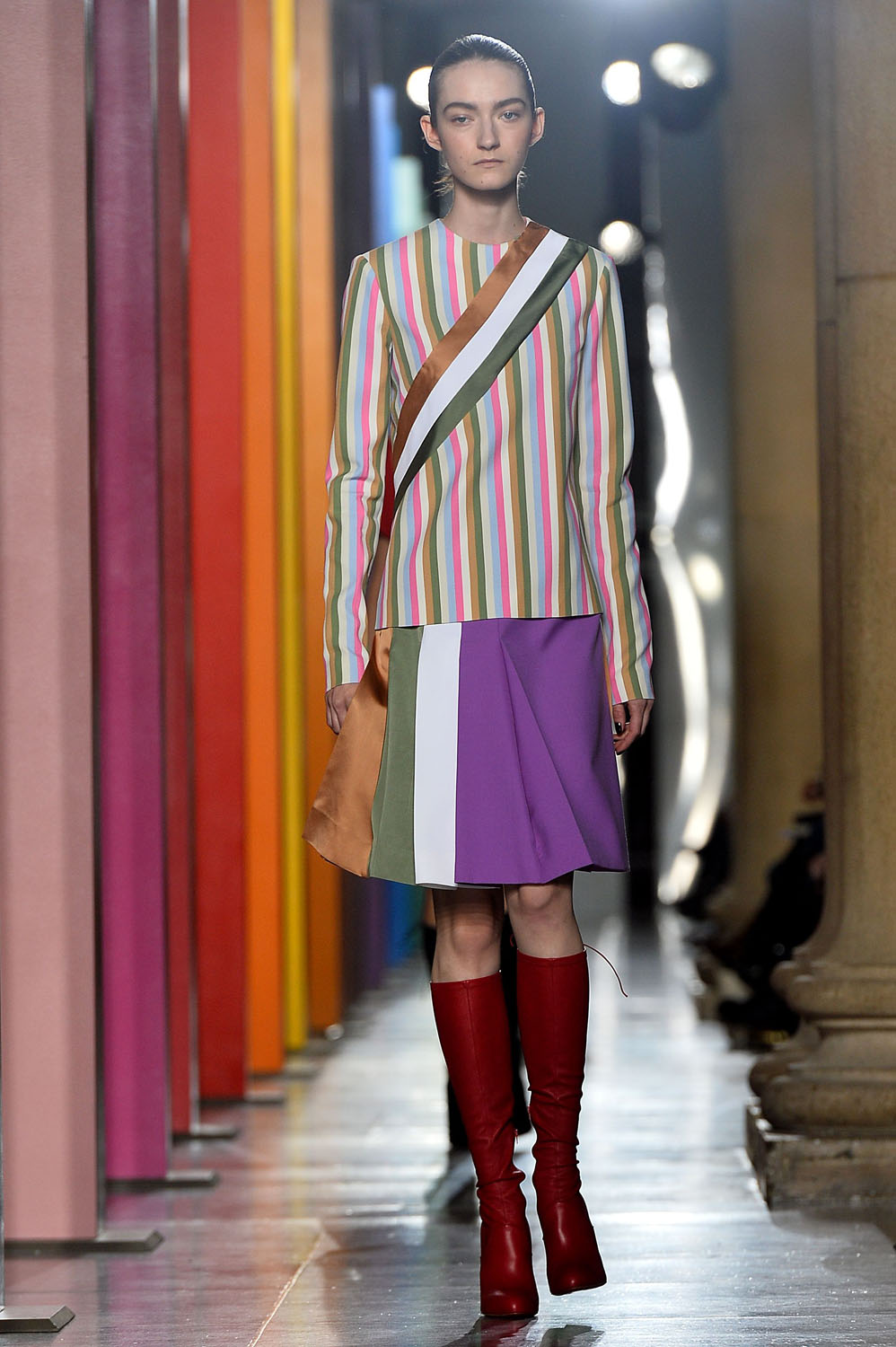
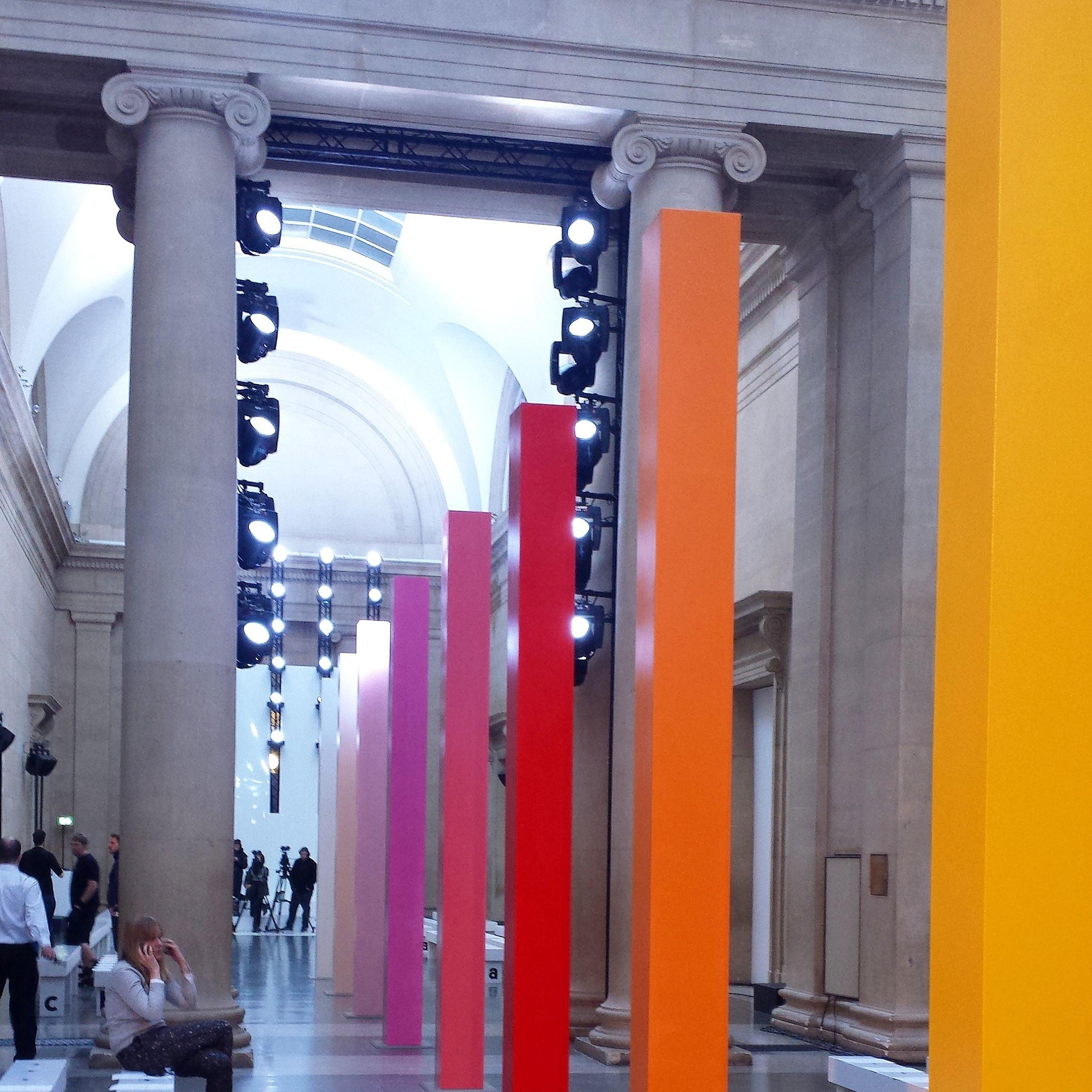
17 Pantone Pillars London's king of colour placed a rainbow of statement pillars down the centre of his runway at Tate Britain, creating a gorgeous optical illusion and a bold background to set off each of his colour clash looks. Simple, effective and totally Instagram-worthy.
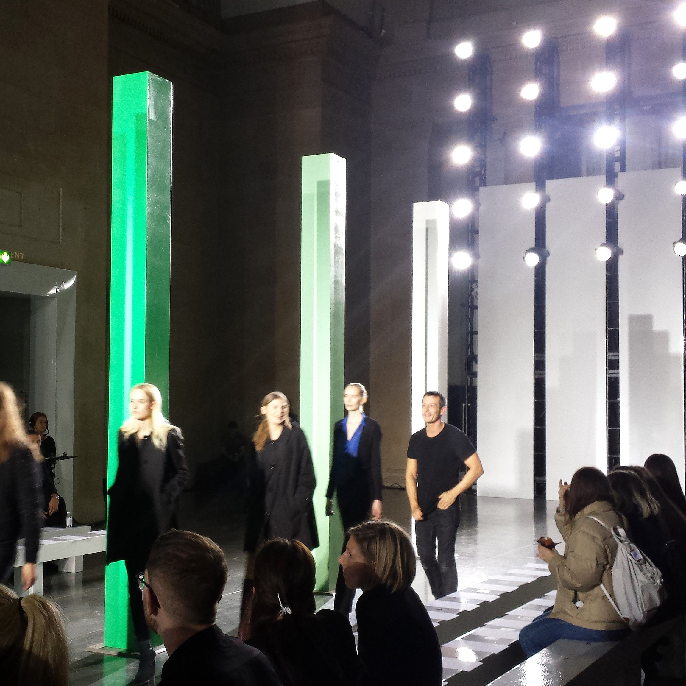
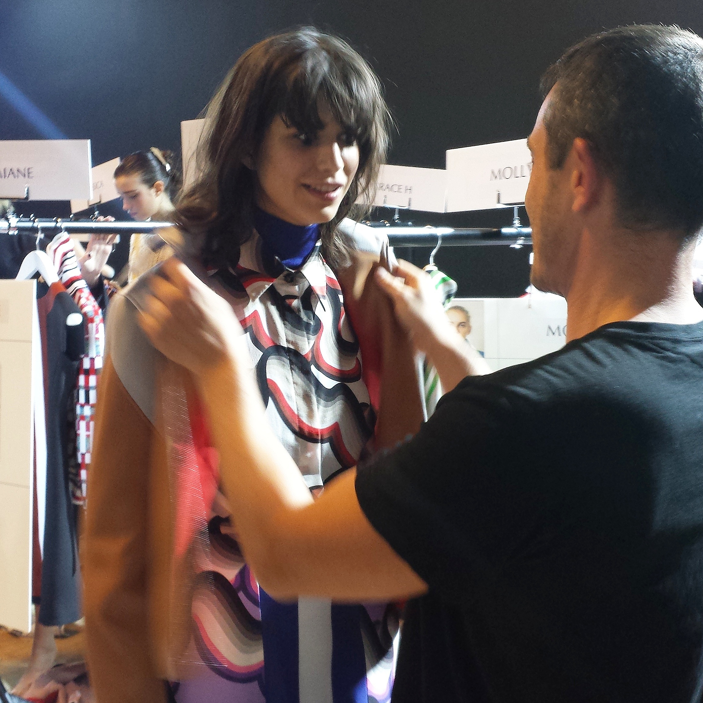
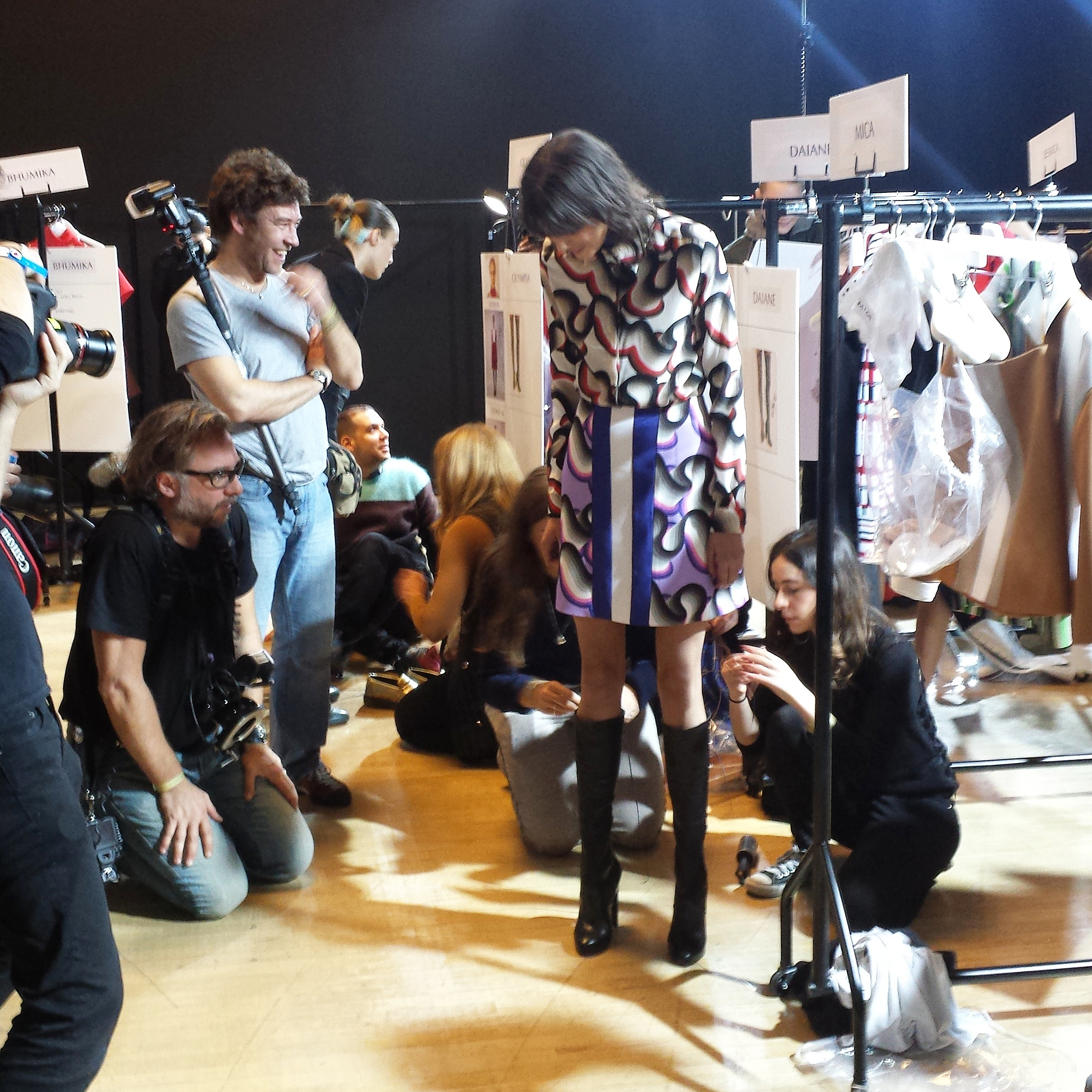
2 Just Lovely Designer Moments Jonathan is a designer who actually enjoys putting on his show – a rarer find than you might think, fash folks. We caught a glimpse of the man in action as he joked his way through final fittings and even got himself involved in the model line-up during rehearsals. It's no wonder they call him the friendliest face in fashion.
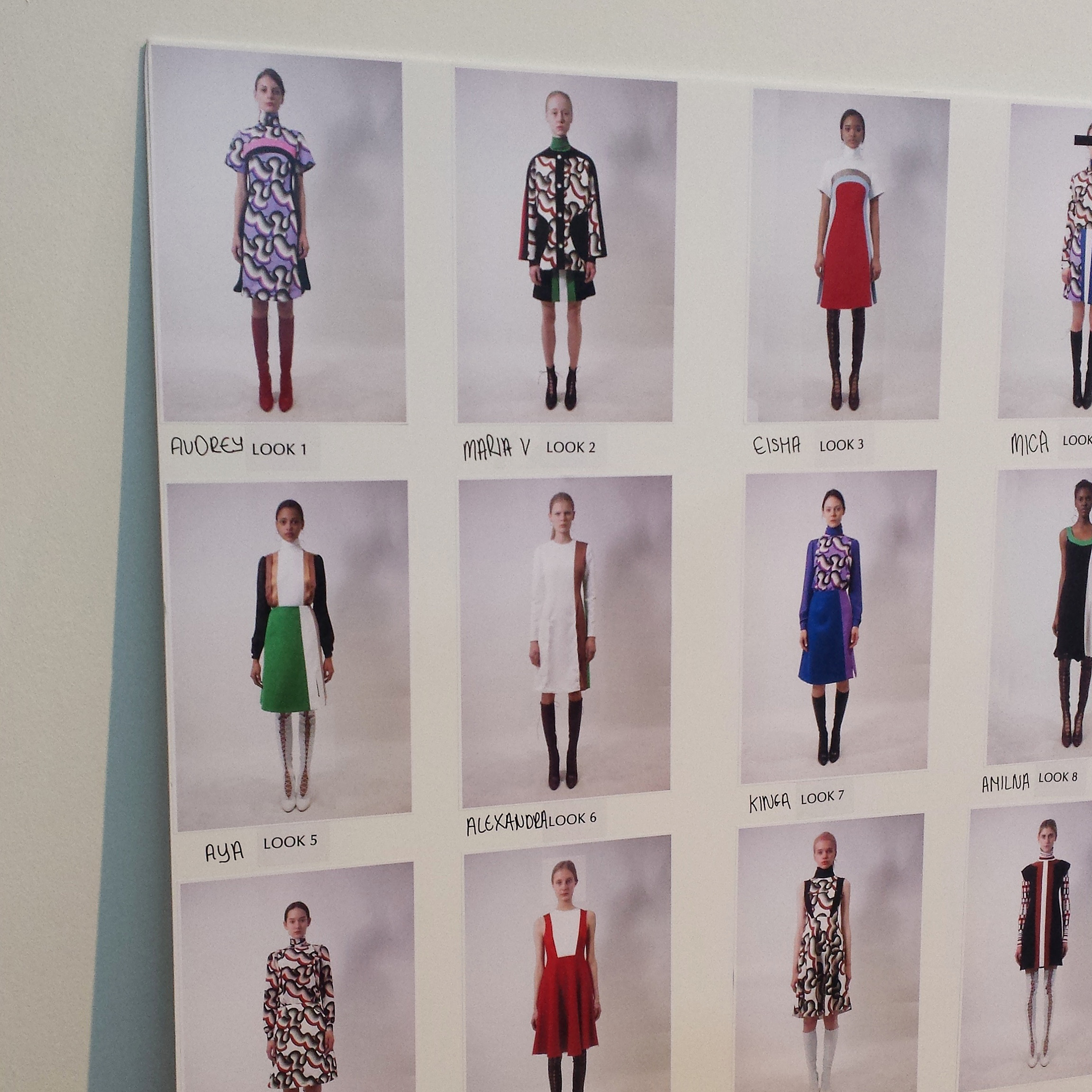
40 Graphic Design Statements From technicolour dream coats to vintage print dresses, it was all about pattern and line in Jonathan's new collection. Off-kilter colour blocking (the designer's signature trick) was stronger than ever and if we can be sure of one thing, it's that the #ThrowbackFashion trends dominating SS15 aren't going anywhere come autumn. See more of the collection in the gallery above and check out those hyper-retro sunglasses ...
3 Dressers Per Pair Of Boots It took the effort of a small army of assistants to lace up each pair of Jonathan's colour-clash patent boots, designed in collaboration with Christian Louboutin. Killer in every sense of the word, the finished look was incredible
, but maybe not an ideal footwear scenario for everyday.
Marie Claire Newsletter
Celebrity news, beauty, fashion advice, and fascinating features, delivered straight to your inbox!
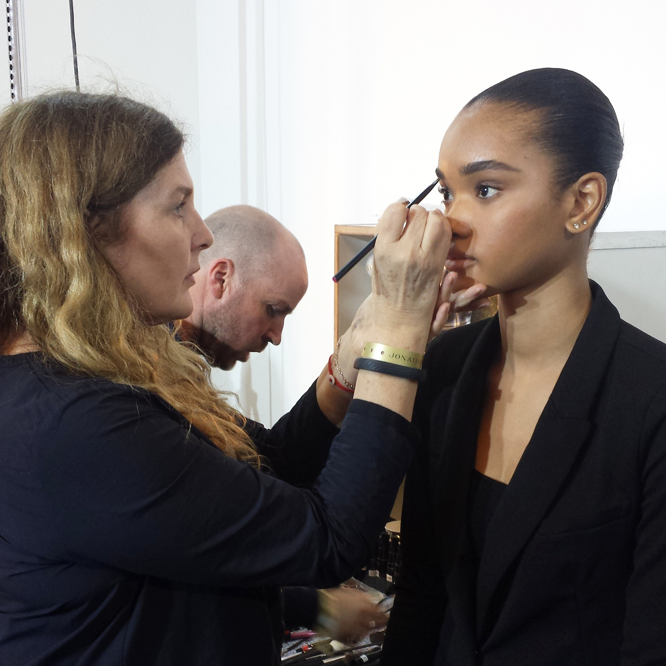
1 Simple And Chic Beauty Look What with so much going on with the clothes, MAC artist Lucia Pieroni decided to strip the beauty look right back, placing emphasis on glossy eyelids and defined eyebrows. She used Vintage Selection, a soft metallic MAC paint pot, to add shine to the eyes and brushed every girl's brows upwards to get her 'boyish' effect.
